Tag Archives: Visualforce Page

Show required symbol in apex:inputText

Controller:

public with sharing class Sample { 

    public String name {Get;set;}
    
    public Sample() {
    
    }
}

Visualforce Page:

<apex:page controller="Sample">
    <apex:form >
        <apex:pageBlock >
            <apex:pageBlockSection >
                <apex:pageBlockSectionItem >
                    <apex:outputLabel value="Name"/>
                    <apex:outputPanel styleClass="requiredInput" layout="block" >
                        <apex:outputPanel styleClass="requiredBlock" layout="block"/>
                        <apex:inputText value="{!name}" required="true"/> 
                    </apex:outputpanel>
                </apex:pageBlockSectionItem>
            </apex:pageBlockSection>
        </apex:pageBlock>
    </apex:form>
</apex:page>

Output:

Display pageBlock Buttons in bottom

We use location attribute in pageBlockButtons to display pageblock button in bottom alone. The possible values of location attribute are “top”, “bottom” and “both”. If not specified, this value defaults to “both”.

Here I’m using location="bottom" to display buttons in bottom only.

<apex:page standardController="Account">
	<apex:form>
		<apex:pageBlock mode="edit">
			<apex:pageBlockButtons location="bottom">
				<apex:commandButton action="{!Save}" value="Save"/>
				<apex:commandButton action="{!Cancel}" value="Cancel" immediate="true" />
			</apex:pageBlockButtons>
			<apex:pageBlockSection columns="2" title="Account Information">
				<apex:inputField value="{!Account.Name}"  required="true"/>
				<apex:inputField value="{!Account.Phone}"/>
			</apex:pageBlockSection>
		</apex:pageBlock>
	</apex:form>
</apex:page>

Note: If a pageBlock header facet is defined, the facet overrides the buttons that would normally appear at the top of the page block. Likewise if a pageBlock footer facet is defined, the facet overrides the buttons that would normally appear at the bottom of the page block.

Use Lightning Component in Visualforce Page

In Winter’16 the ability to add Lightning Components to Visualforce pages was made generally available. This powerful new feature allows you to reuse existing Lightning Components or design and implement new features as Lightning Components with the flexibility to use of them in new or existing Visualforce pages.

This article is to show you how to add Lightning components to Visualforce pages.

Let’s create a lightning component named “HelloWorld.cmp” either through developer console or through your IDE. Use the below mentioned code in your lightning component.

Lightning Component:

<!--HelloWorld-->
<aura:component implements="force:appHostable">
    <div>
        Hello World    
    </div>
</aura:component>

Now we use this Lightning component in a Lightning app. For this I recommend you to create a new Lightning app, let’s call it “HelloWorldApp.app” and use the above lightning component “HelloWorld.cmp” in this app.

Lightning App:

<!--HelloWorldApp-->
<aura:application extends="ltng:outApp" access="global">
    <aura:dependency resource="c:HelloWorld"/>
</aura:application>

In above Lightning app, I have used aura application access as global, so that it can be used anywhere in Salesforce organization like Visualforce. Extending ltng:outApp indicates that any component defined in this application can be used on Visualforce page.

Now create a VisualForce page which would display this lightning component. VisualForce page would provide the interface where we can view the lightning component that we are going to use in the page. Use the below code in your VF page.

In my Visualforce page, we have a special include apex:includeLightning for Lighting. We also need to create a container div id="LightningContainer" for the Lightning components to appear in.

Visualforce Page:

<apex:page >
    <apex:includeLightning />
    <div style="width:100%;height:100px;" id="LightningContainer" />
    
    <script>
        $Lightning.use("c:HelloWorldApp", function() {
            $Lightning.createComponent("c:HelloWorld", { },
            "LightningContainer",
            function(cmp) {
                console.log('Component created');
            });
        });
    </script>
</apex:page>

Note: If your Org has a namespace, then in Visualforce page we have to mention the namespace for Lightning app as yournamespace:HelloWorldApp instead of c:HelloWorldApp.

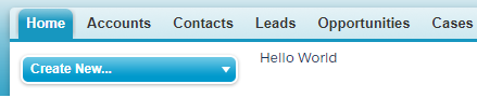
Here is the Visualforce page output:

Show =required information along with red bar on the Page Block section of VF Page

Set the apex:pageBlock mode="edit".

<apex:page standardController="Account">
	<apex:form>
        <apex:pageBlock mode="edit" title="Account">
            <apex:pageBlockButtons >
                <apex:commandButton action="{!save}" value="Save"/>
            </apex:pageBlockButtons>
            <apex:outputPanel>
                <apex:pageBlockSection columns="2" title="Account Information">
                    <apex:inputField value="{!Account.Name}" required="true"/>
                    <apex:inputField value="{!Account.Phone}"/>
                </apex:pageBlockSection>
            </apex:outputPanel>
        </apex:pageBlock>
    </apex:form>
</apex:page>