Tag Archives: Helptext

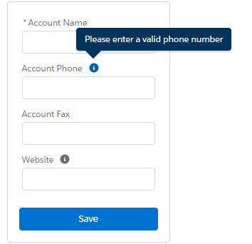
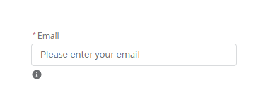
Helptext Is Not Working In Lighting Out

Due to some issue in Salesforce lightning css, helpText is not displaying properly in lightning out. Using following styles in your visualforce page, you can display the helptext properly.

CSS:

<style>
        .slds-popover {
        position: relative;
        border-radius: .25rem;
        width: 20rem;
        min-height: 2rem;
        z-index: 6000;
        background-color: #fff;
        display: inline-block;
        box-shadow: 0 2px 3px 0 rgba(0, 0, 0, .16);
        border: 1px solid #d9dbdd;
        font-family: 'Salesforce Sans',Arial,sans-serif;
        }
        
        .slds-popover__body,
        .slds-popover__footer,
        .slds-popover__header {
        position: relative;
        padding: .5rem .75rem;
        word-wrap: break-word;
        }
        
        .slds-popover--tooltip .slds-popover__body,
        .slds-popover_tooltip .slds-popover__body {
        font-size: .75rem;
        color: #fff
        }
        
        .slds-popover--tooltip,
        .slds-popover_tooltip {
        width: auto;
        max-width: 20rem;
        background: #16325c;
        border: 0;
        }
        
        .slds-nubbin--bottom-left:before,
        .slds-nubbin_bottom-left-corner:before,
        .slds-nubbin_bottom-left:before {
        width: 1rem;
        height: 1rem;
        position: absolute;
        transform: rotate(45deg);
        content: '';
        background-color: inherit;
        bottom: -.5rem;
        margin-left: -.5rem;
        }
        
        .slds-nubbin--bottom-left:after,
        .slds-nubbin--bottom-left:before,
        .slds-nubbin_bottom-left-corner:after,
        .slds-nubbin_bottom-left-corner:before,
        .slds-nubbin_bottom-left:after,
        .slds-nubbin_bottom-left:before {
        left: 1.5rem;
        top: 100%;
        margin-top: -.5rem;
        }
    </style>

Tooltip or Helptext in Lightning Component

A lightning:helptext component displays an icon with a popover containing a small amount of text describing an element on screen. The popover is displayed when you hover or focus on the icon that’s attached to it. This component is similar to a tooltip and is useful to display field-level help text. HTML markup is not supported in the tooltip content.

Sample Lightning Component:

<!--Sample.app-->
<aura:component >
    <div class="slds-m-around_xx-large">
        <div class="slds-form-element">
            <lightning:input aura:id="email" placeholder="Please enter your email" required="true" type="email" label="Email" name="email" />
            <!--Helptext and tooltip component-->
            <lightning:helptext iconName="utility:info" content="Your email address will be your login name" />
        </div>
    </div>
</aura:component>

Lightning Test App:

<!--Test.app-->
<aura:application extends="force:slds">
    <c:Sample />
</aura:application>

Output: