jQuery Data Tables in Visualforce Page
Biswajeet
December 15, 2017 2 Comments on jQuery Data Tables in Visualforce Page
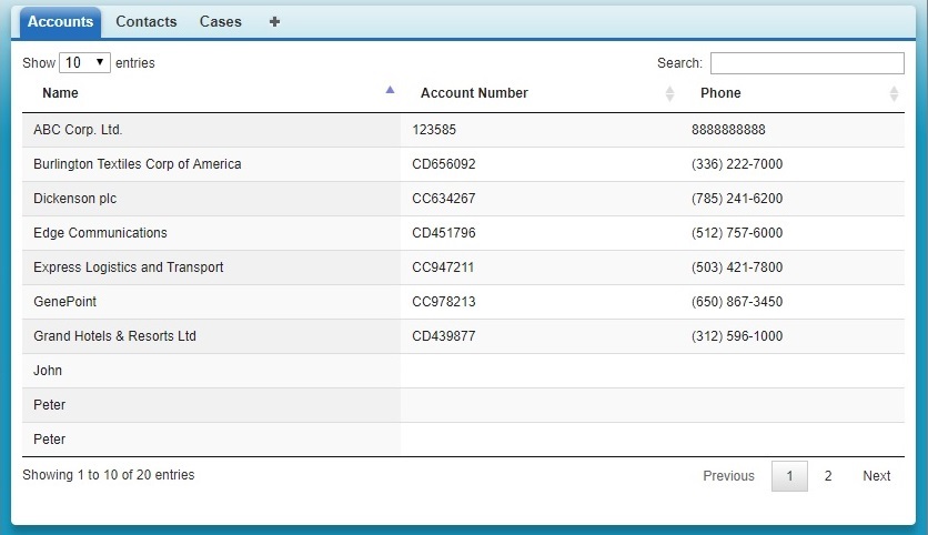
Here is an example of jQuery Data tables using in Visualforce. It will give you the pagination and search functionality in Visualforce page. Here I’m displaying list of account records.
Apex Class:
public class SampleController{
    public List<Account> accList {get; set;}

    public SampleController(){
    accList = [SELECT Name, AccountNumber, Phone FROM Account LIMIT 10000];
    }

}
Visualforce Page:
<apex:page Controller="SampleController" readOnly="true" tabStyle="Account" sidebar="false">
    <head>
        <apex:includescript value="//code.jquery.com/jquery-1.11.1.min.js"/>
        <apex:includescript value="//cdn.datatables.net/1.10.4/js/jquery.dataTables.min.js"/>
        <apex:stylesheet value="//cdn.datatables.net/1.10.4/css/jquery.dataTables.css"/>
        <script>
        j$ = jQuery.noConflict();
        j$(document).ready( function () {
            var accTable = j$('[id$="accTable"]').DataTable({

            });
        });
        </script>
    </head>
    <body>
        <table id="accTable" class="display">
            <thead>
                <tr>
                    <th>Name</th>
                    <th>Account Number</th>
                    <th>Phone</th>
                </tr>
            </thead>
            <tbody>
                <apex:repeat value="{!accList}" var="acc">
                    <tr>
                        <td>{!acc.Name}</td>
                        <td>{!acc.AccountNumber}</td>
                        <td>{!acc.Phone}</td>
                    </tr>
                </apex:repeat>
            </tbody>
        </table>
    </body>
</apex:page>
Output: