Category Archives: Salesforce

Get Data From Visualforce Controller Extension Without SOQL Query

When a Visualforce page is loaded, the fields accessible to the page are based on the fields referenced in the Visualforce markup. But we can use StandardController.addFields(List fieldNames) method, which adds a reference to each field specified in fieldNames so that the controller can explicitly access those fields as well.

public with sharing class AccountControllerExt {
    public Account acc {get; set;}
    
    public AccountControllerExt(ApexPages.StandardController controller) {
        List<String> accFieldList = new List<String>();
        //Passing a list of field names to the standard controller
        controller.addFields(new List<String>{'Id', 'Name', 'AccountNumber', 'Website', 'Phone','Type', 'Industry'});
        //Standard controller to retrieve the field data of the record
        acc = (Account)controller.getRecord();
    }
}

Padding String in Salesforce Apex

Left Pad:

leftPad(length): Returns the current String padded with spaces on the left and of the specified length. If length is less than or equal to the current String size, the entire String is returned without space padding.

String name = 'biswa';
String lpName = name.leftPad(8);
System.debug('LeftPad-' + lpName);
System.assertEquals('   biswa', lpName);

leftPad(length, padStr): Returns the current String padded with String padStr on the left and of the specified length. padStr to pad with; if null or empty treated as single blank.

Integer num = 555;
String lpString = String.valueOf(num).leftPad(5, '0');
System.debug('LeftPad-' + lpString);
System.assertEquals('00555', lpString);

Right Pad:

rightPad(length): Returns the current String padded with spaces on the right and of the specified length. If length is less than or equal to the current String size, the entire String is returned without space padding.

String name = 'biswa';
String rpName = name.rightPad(8);
System.debug('RightPad-' + rpName);
System.assertEquals('biswa   ', rpName);

rightPad(length, padStr): Returns the current String padded with String padStr on the right and of the specified length. padStr to pad with; if null or empty treated as single blank.

Integer num = 555;
String rpString = String.valueOf(num).rightPad(5, '0');
System.debug('RightPad-' + rpString);
System.assertEquals('55500', rpString);

Visualforce Pages with Lightning Experience Stylesheets

In Winter’18 release, Salesforce has introduced lightningStylesheets attribute. To style the Visualforce page to match the Lightning Experience UI when viewed in Lightning Experience or the Salesforce app, We can set lightningStylesheets="true" in the apex:page tag. When the page is viewed in Salesforce Classic, it doesn’t get Lightning Experience styling.

Here is a standard Visualforce page with the lightningStylesheets="true" attribute in Classic View and Lightning View.

Visualforce Page:

<apex:page standardController="Account" lightningStylesheets="true">
    <apex:form> 
        <apex:pageBlock>
            <apex:pageblockButtons location="bottom">
                <apex:commandButton action="{!Save}" value="Save"/>
                <apex:commandButton action="{!Cancel}" value="Cancel"/>
            </apex:pageblockButtons>
            <apex:pageBlockSection columns="2" title="Create Account">
                <apex:inputField value="{!Account.Name}"/>
                <apex:inputField value="{!Account.AccountNumber}"/>
                <apex:inputField value="{!Account.Phone}"/>
                <apex:inputField value="{!Account.Website}"/>
                <apex:inputField value="{!Account.Type}"/>
                <apex:inputField value="{!Account.Industry}"/>                
            </apex:pageBlockSection>
        </apex:pageBlock>
    </apex:form>
</apex:page>

Visualforce Page Classic View:

Visualforce Page Lightning View:

As of Winter’18 release, the following Visualforce components support the lightningStylesheets attribute or don’t require styling.

analytics:reportChart
apex:actionFunction
apex:actionPoller
apex:actionRegion
apex:actionStatus
apex:actionSupport
apex:areaSeries
apex:attribute
apex:axis
apex:barSeries
apex:canvasApp
apex:chart
apex:chartLabel
apex:chartTips
apex:column
apex:commandButton
apex:commandLink
apex:component
apex:componentBody
apex:composition
apex:dataList
apex:dataTable
apex:define
apex:detail
apex:dynamicComponent
apex:enhancedList
apex:facet
apex:flash
apex:form
apex:gaugeSeries
apex:iframe
apex:image
apex:include
apex:includeLightning
apex:includeScript
apex:inlineEditSupport
apex:input
apex:inputCheckbox
apex:inputField
apex:inputFile
apex:inputHidden
apex:inputSecret
apex:inputText
apex:inputTextArea
apex:insert
apex:legend
apex:lineSeries
apex:listViews
apex:map
apex:mapMarker
apex:message
apex:messages
apex:outputField
apex:outputLabel
apex:outputLink
apex:outputPanel
apex:outputText
apex:page
apex:pageBlock
apex:pageBlockButtons
apex:pageBlockSection
apex:pageBlockSectionItem
apex:pageBlockTable
apex:pageMessage
apex:pageMessages
apex:panelBar
apex:panelBarItem
apex:panelGrid
apex:panelGroup
apex:param
apex:pieSeries
apex:radarSeries
apex:relatedList
apex:remoteObjectField
apex:remoteObjectModel
apex:remoteObjects
apex:repeat
apex:scatterSeries
apex:scontrol
apex:sectionHeader
apex:selectCheckboxes
apex:selectList
apex:selectOption
apex:selectOptions
apex:selectRadio
apex:stylesheet
apex:tab
apex:tabPanel
apex:toolbar
apex:toolbarGroup
apex:variable
chatter:feed
chatter:feedWithFollowers
chatter:follow
chatter:newsFeed
flow:interview
site:googleAnalyticsTracking
site:previewAsAdmin
topics:widget

Salesforce Lightning Tree

lightning:tree component displays visualization of a structural hierarchy, such as a sitemap for a website or a role hierarchy in an organization. Items are displayed as hyperlinks and items in the hierarchy can be nested. Items with nested items are also known as branches.

To create a tree, we have to pass in an array of key-value pairs to the items attribute.
Below are the keys:

  • disabled (Boolean): Specifies whether a branch is disabled. A disabled branch can’t be expanded. The default is false.
  • expanded (Boolean): Specifies whether a branch is expanded. An expanded branch displays its nested items visually. The default is false.
  • href (String): The URL of the link.
  • name (String): The unique name for the item for the onselect event handler to return the tree item that was clicked.
  • items (Object): Nested items as an array of key-value pairs.
  • label (String): Required. The title and label for the hyperlink.

Here is an example of Lightning Tree with list of accounts and respective contacts.

Apex Controller:

public class TreeAuraController {
    
    @AuraEnabled
    public static List<item> getAccountTree(){
        
        List<item> items = new List<item>();
        List<Account> acctList = new List<Account>();
        //get list of accounts and respective contacts
        acctList = [SELECT Id, Name, (SELECT Id, Name From Contacts) From Account LIMIT 10];
        for(Account acc: acctList){
            
            //get contacts of current account record
            List<item> conitems = new List<item>();
            for(Contact c: acc.Contacts){
                //add contact items
                item conitem = new item(c.Name, String.valueOf(c.Id), false, null);
                conitems.add(conitem);
            }
            
            //add account items
            item accitem = new item(acc.Name, String.valueOf(acc.Id), false, conitems);
            items.add(accitem);
        }
        return items;
    }
    
    //Item Wrapper Class
    public class item{
        @AuraEnabled
        public String label {get; set;}
        @AuraEnabled
        public String name {get; set;}
        @AuraEnabled
        public Boolean expanded {get; set;}
        @AuraEnabled
        public List<item> items {get; set;}
        
        public item(String label, String name, Boolean expanded, List<item> items){
            this.label = label;
            this.name = name;
            this.expanded = expanded;
            this.items = items;
        }
    }
}

Lightning Component:

<!--Tree.cmp-->
<aura:component controller="TreeAuraController">
    <aura:handler name="init" value="{!this}" action="{!c.doInit}"/>
    <aura:attribute name="items" type="Object"/>
    <!--Lightning Tree-->
    <div class="slds-m-around_xx-large">
        <lightning:tree items="{!v.items}" onselect="{!c.handleSelect}" header="Account and Contacts"/>
    </div>
    <!--Lightning Spinner-->
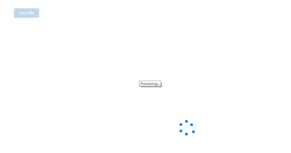
    <div>
        <lightning:spinner alternativeText="Processing.." title="Processing.." aura:id="spnr" variant="brand" size="large" />
    </div>
</aura:component>

Lightning Component JS Controller:

({
    doInit: function (component, event, helper) {
        var spinner = component.find("spnr");
        var action = component.get('c.getAccountTree');
        action.setCallback(this, function(response){
            var state = response.getState();
            if(state === 'SUCCESS'){
                //get account and respective contact list, and initialize with items
                component.set('v.items', response.getReturnValue());
                //hide spinner after getting data
                $A.util.toggleClass(spinner, "slds-hide");
            }else{
                $A.util.toggleClass(spinner, "slds-hide");
                alert('ERROR');
            }
        });
        $A.enqueueAction(action);
    },
    handleSelect: function (cmp, event, helper) {
        //return name of selected tree item
        var selectedName = event.getParam('name');
        alert("Selected Name: " + selectedName);
    }
})

Lightning Test App:

<!--Test.app-->
<aura:application extends="force:slds">
    <c:Tree />
</aura:application>

Output:

Salesforce Lightning Spinner

lightning:spinner displays an animated spinner image to indicate that a feature is loading. This component can be used when retrieving data or anytime an operation doesn’t immediately complete.

Here is an example to show the lightning:spinner on click of a button.

Apex Controller:

public class SampleAuraController {
    
    @AuraEnabled
    public static String getMessage() {
        return 'Hello World!!';
    }
}

Lightning Component:

<!--Sample.cmp--> 
<aura:component controller="SampleAuraController" implements="flexipage:availableForAllPageTypes,force:appHostable">
    <!--Component Start-->
    <div class="slds-m-around_xx-large">
        <lightning:button label="Click Me" variant="brand" onclick="{!c.handleClick}"/>
        <lightning:spinner aura:id="mySpinner" alternativeText="Processing.." title="Processing.." variant="brand" size="large" class="slds-hide"/>
    </div>
    <!--Component End-->
</aura:component>

Lightning Component JS Controller:

({
    handleClick: function (component, event, helper) {
        helper.showSpinner(component);
        var action = component.get('c.getMessage');
        action.setCallback(this,function(response){
            var state = response.getState();
            if (state === "SUCCESS") {
                helper.hideSpinner(component);
            }
        });
        $A.enqueueAction(action);
    }
})

Lightning Component JS Helper:

({
    showSpinner: function (component, event, helper) {
        var spinner = component.find("mySpinner");
        $A.util.removeClass(spinner, "slds-hide");
    },
    
    hideSpinner: function (component, event, helper) {
        var spinner = component.find("mySpinner");
        $A.util.addClass(spinner, "slds-hide");
    }
})

Output:

We can use lightning:spinner as conditionally, using aura:if or the Lightning Design System utility classes to show or hide the spinner.

The variant attribute changes the appearance of the spinner. If you set variant=”brand”, the spinner matches the Lightning Design System brand color. Setting variant=”inverse” displays a white spinner. The default spinner color is dark blue.