Author Archives: Biswajeet

About Biswajeet

Biswajeet is my Name, Success is my Aim and Challenge is my Game. Risk & Riding is my Passion and Hard Work is my Occupation. Love is my Friend, Perfection is my Habit and Smartness is my Style. Smiling is my Hobby, Politeness is my Policy and Confidence is my Power.

Find Out Which Button was Clicked in Lightning Component

To find out which button was clicked in a component containing multiple buttons, we can use Component.getLocalId().

Here is an example with multiple lightning:button components. Each button has a unique local ID, set by an aura:id attribute.

Sample Lightning Component:

<!--Sample.cmp-->
<aura:component>
    <aura:attribute name="clickedButton" type="String" />
    <div class="slds-m-around_xx-large">
        <p><b>You Clicked: {!v.clickedButton}</b></p>
        <br/>
        <lightning:button aura:id="button1" name="btn1" label="Click Me" onclick="{!c.buttonClick}"/>
        <lightning:button aura:id="button2" name="btn2" label="Click Me" onclick="{!c.buttonClick}"/>
    </div>
</aura:component>

In the JS controller, we can use one of the following methods to find out which button was clicked.
event.getSource().getLocalId() returns the aura:id of the clicked button.
event.getSource().get("v.name") returns the name of the clicked button.

Sample Lightning Component JS Controller:

({
    buttonClick : function(cmp, event, helper) {
        var clickedBtn = event.getSource().getLocalId();
        alert(clickedBtn);
        cmp.set("v.clickedButton", clickedBtn);
    }
})

Lightning Test App:

<!--Test.app-->
<aura:application extends="force:slds">
    <c:Sample />
</aura:application>

Output:

Salesforce IMAGE Function in Formula Field

In Salesforce formula field using IMAGE(image_url, alternate_text, height, width) function, we can insert an image with alternate text and height/width specifications.

In below example, I’ve created a custom field “Priority__c” in “Case” object with below formula. This formula displays a red, yellow, or green flag image to indicate case priority High, Medium or Low.

Formula Field:

	 
IF(TEXT(Priority) = 'High', IMAGE("/img/samples/color_red.gif", "Red", 10 , 50), 
IF(TEXT(Priority) = 'Medium', IMAGE("/img/samples/color_yellow.gif", "Yellow", 10, 50), 
IF(TEXT(Priority) = 'Low', IMAGE("/img/samples/color_green.gif", "Green", 10, 50), 
NULL)))

Output:

jQuery Data Tables in Visualforce Page

Here is an example of ‎jQuery Data tables using in Visualforce. It will give you the pagination and search functionality in Visualforce page. Here I’m displaying list of account records.

Apex Class:

public class SampleController{
    public List<Account> accList {get; set;}
    
    public SampleController(){
    accList = [SELECT Name, AccountNumber, Phone FROM Account LIMIT 10000];
    }

}

Visualforce Page:

<apex:page Controller="SampleController" readOnly="true" tabStyle="Account" sidebar="false">
    <head>
        <apex:includescript value="//code.jquery.com/jquery-1.11.1.min.js"/>
        <apex:includescript value="//cdn.datatables.net/1.10.4/js/jquery.dataTables.min.js"/>
        <apex:stylesheet value="//cdn.datatables.net/1.10.4/css/jquery.dataTables.css"/>
        <script>
        j$ = jQuery.noConflict();
        j$(document).ready( function () {
            var accTable = j$('[id$="accTable"]').DataTable({
                
            });
        });
        </script>
    </head>
    <body>
        <table id="accTable" class="display">
            <thead>
                <tr>
                    <th>Name</th>
                    <th>Account Number</th>
                    <th>Phone</th>
                </tr>
            </thead>
            <tbody>
                <apex:repeat value="{!accList}" var="acc">
                    <tr>
                        <td>{!acc.Name}</td>
                        <td>{!acc.AccountNumber}</td>
                        <td>{!acc.Phone}</td>
                    </tr>
                </apex:repeat>
            </tbody>
        </table>
    </body>
</apex:page>

Output:

Progress Indicator in Lightning Component

Progress Indicator Component:

<!--ProgressIndicator.cmp-->
<aura:component >
    <aura:attribute name="selectedStep" type="string" default="step1"/>
    <div class="slds-m-around_xx-large">
        
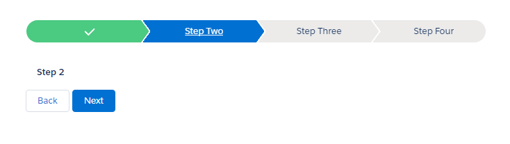
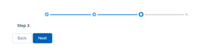
        <lightning:progressIndicator currentStep="{!v.selectedStep}" type="base">
            <lightning:progressStep label="Step One" value="step1" onclick="{!c.selectStep1}"/>
            <lightning:progressStep label="Step Two" value="step2" onclick="{!c.selectStep2}"/>
            <lightning:progressStep label="Step Three" value="step3" onclick="{!c.selectStep3}"/>
            <lightning:progressStep label="Step Four" value="step4" onclick="{!c.selectStep4}"/>
        </lightning:progressIndicator>
        
        <div class="slds-p-around--medium">
            <div class="{!v.selectedStep == 'step1' ? 'slds-show' : 'slds-hide'}">
                <p><b>Step 1</b></p>
            </div>
            <div class="{!v.selectedStep == 'step2' ? 'slds-show' : 'slds-hide'}">
                <p><b>Step 2</b></p>
            </div>
            <div class="{!v.selectedStep == 'step3' ? 'slds-show' : 'slds-hide'}">
                <p><b>Step 3</b></p>
            </div>
            <div class="{!v.selectedStep == 'step4' ? 'slds-show' : 'slds-hide'}">
                <p><b>Step 4</b></p>
            </div>
        </div>
        
        <div>
            <button disabled="{!v.selectedStep != 'step1' ? '' : 'disabled'}" class="slds-button slds-button--neutral" onclick="{!c.handlePrev}">Back</button>  
            <aura:if isTrue="{!v.selectedStep != 'step4'}">
                <button class="slds-button slds-button--brand" onclick="{!c.handleNext}">Next</button>
            </aura:if>
            <aura:if isTrue="{!v.selectedStep == 'step4'}">   
                <button class="slds-button slds-button--brand" onclick="{!c.handleFinish}">Finish</button>  
            </aura:if>
        </div>
    </div>
</aura:component>

Progress Indicator Component JS Controller:

({
    handleNext : function(component,event,helper){
        var getselectedStep = component.get("v.selectedStep");
        if(getselectedStep == "step1"){
            component.set("v.selectedStep", "step2");
        }
        else if(getselectedStep == "step2"){
            component.set("v.selectedStep", "step3");
        }
         else if(getselectedStep == "step3"){
            component.set("v.selectedStep", "step4");
        }
    },
    
    handlePrev : function(component,event,helper){
        var getselectedStep = component.get("v.selectedStep");
        if(getselectedStep == "step2"){
            component.set("v.selectedStep", "step1");
        }
        else if(getselectedStep == "step3"){
            component.set("v.selectedStep", "step2");
        }
        else if(getselectedStep == "step4"){
            component.set("v.selectedStep", "step3");
        }
    },
    
    handleFinish : function(component,event,helper){
        alert('Finished...');
        component.set("v.selectedStep", "step1");
    },
    
    selectStep1 : function(component,event,helper){
        component.set("v.selectedStep", "step1");
    },
    selectStep2 : function(component,event,helper){
        component.set("v.selectedStep", "step2");
    },
    selectStep3 : function(component,event,helper){
        component.set("v.selectedStep", "step3");
    },
    selectStep4 : function(component,event,helper){
        component.set("v.selectedStep", "step4");
    },
})

Lightning Test App:

<!--Test.app-->
<aura:application extends="force:slds">
    <c:ProgressIndicator />
</aura:application>

Output:

Note: To create “base” style progress indicator you have need to add type="base" attribute in your lightning:progressIndicator tag in lightning component.

Modal Box in Lightning Component

Modal Popup Component:

<!--ModalPopup.app-->
<aura:component>
    <aura:attribute name="openModal" type="boolean" default="false"/>
    <div class="slds-m-around--xx-large">
        <button class="slds-button slds-button--brand" onclick="{!c.handleOpenModal}">Open Modal</button>  
        <aura:if isTrue="{!v.openModal}">
            <!--Modal Box Start--> 
            <div role="dialog" class="slds-modal slds-fade-in-open ">
                <div class="slds-modal__container">
                    <div class="slds-modal__header">
                        <button class="slds-button slds-modal__close slds-button--icon-inverse" title="Close" onclick="{!c.handleCloseModal}">
                            X
                            <span class="slds-assistive-text">Close</span>
                        </button>
                        <h1 class="slds-text-heading--medium">Biswajeet Samal</h1>
                    </div>
                    
                    <!--Modal Box Header--> 
                    <div class="slds-modal__content slds-p-around--medium">
                        <center> <p><b>
                            Welcome to Biswajeet Samal's Blog
                            </b>
                            </p></center>
                    </div>
                    <!--Modal Box Button--> 
                    <div class="slds-modal__footer">
                        <button class="slds-button slds-button--brand" onclick="{!c.handleCloseModal}">Cancel</button>
                    </div>
                </div>
            </div>
            <div class="slds-backdrop slds-backdrop--open"></div>            
        </aura:if>
    </div>
</aura:component>

Modal Popup Component JS Controller:

({
    handleOpenModal: function(component, event, helper) {
        //For Display Modal, Set the "openModal" attribute to "true"
        component.set("v.openModal", true);
    },
    
    handleCloseModal: function(component, event, helper) {
        //For Close Modal, Set the "openModal" attribute to "fasle"  
        component.set("v.openModal", false);
    }
})

Lightning Test App:

<!--Test.app-->
<aura:application extends="force:slds">
    <c:ModalPopup />
</aura:application>

Output: